How Colour Psychology in the Workplace Boosts Productivity and Wellbeing
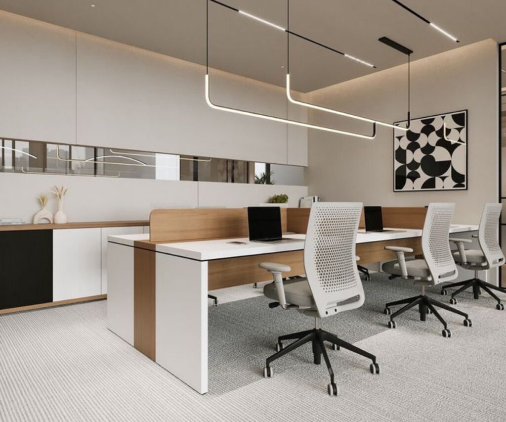
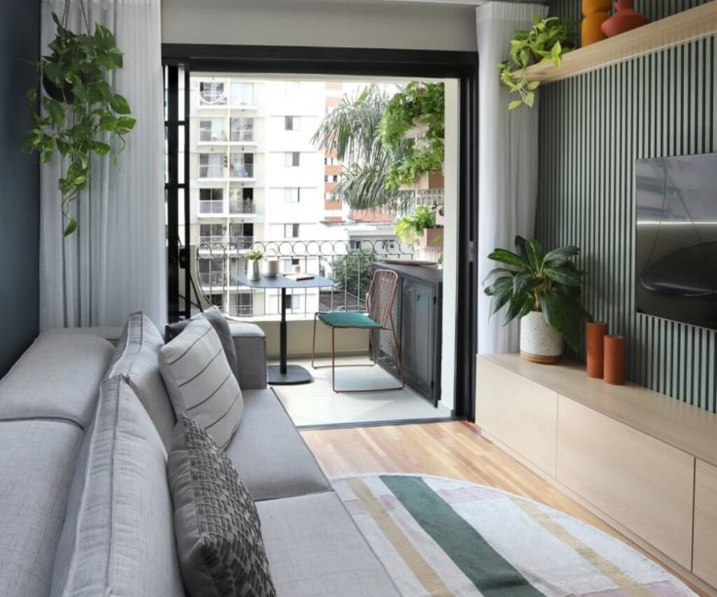
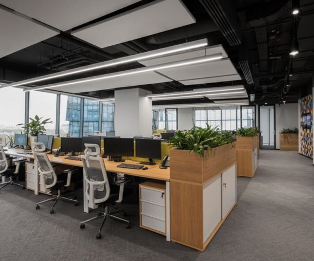
Unlocking the Power of Colour Psychology to Transform Your Workspace Ever feel like your work environment doesn’t quite match your energy or personality? Or perhaps you’ve noticed a dip in productivity at a certain office? Surprisingly, the culprit might be the color scheme. Colors influence more than just aesthetics—they impact emotions, focus, and productivity. Color plays a deeper role in our daily lives than we often realize. Using the right colors in a workspace can uplift moods, reduce stress, and enhance efficiency. Research supports that color psychology can significantly improve employee satisfaction, productivity, and even influence how clients and visitors perceive the organization. Before we explore specific colors and their effects, let’s understand what color psychology really means in the context of office design. What is Color Psychology? Color psychology studies how different colors influence human behavior and emotion. A person’s color preferences can often offer insight into their personality and temperament. Key principles include: Each color conveys specific meanings and feelings. Perceptions of color can trigger emotional and behavioral responses. Context heavily influences the interpretation and impact of color. Color associations can be both innate and culturally learned. Color responses can be automatic and subconscious. Colors have the power to evoke physiological reactions—some can raise blood pressure or boost metabolism. When paired with good ergonomic design, color can play a crucial role in improving overall workplace well-being and functionality. Best Colors for Workplaces Color psychology has found application across many fields, including interior design and office planning. Selecting the right color scheme for a workspace can significantly influence focus, collaboration, and overall performance. Here are some of the top-performing colors and their ideal use in offices: Blue – The Focus Enhancer Light blue is especially effective in analytical environments, such as finance or accounting departments. This cool-toned color is known for its calming effects, helping reduce stress and improve concentration. Blue also symbolizes trust, intelligence, and order. Pairing blue with neutrals like white helps prevent a sterile atmosphere. Consider adding orange accents to introduce balance and warmth. Yellow – The Mood Booster Yellow is associated with optimism and creativity. It can enhance natural light, add warmth, and foster a cheerful ambiance. Soft yellow tones, like buttery or golden hues, work well as accent walls or in breakrooms, creating a stimulating yet non-overwhelming environment. Yellow is often linked to memory retention and mental stimulation, making it great for training rooms and learning zones. Green – The Harmony Bringer Green promotes calmness, balance, and rejuvenation. It’s easy on the eyes, reducing visual fatigue, and encouraging steady focus. Green is especially suited to areas where employees spend long hours—personal workstations, meeting rooms, or lounges. Incorporating greenery, plants, or natural green shades can also enhance biophilic design, boosting overall wellness in the office. Red – The Energy Driver Red evokes power, passion, and urgency. It physically stimulates the body by increasing heart rate and circulation. This makes red suitable for dynamic areas like sales departments or collaborative zones. Due to its intensity, use red sparingly—perhaps in accent walls, furniture details, or small décor items. Softer shades or pairing red with neutral tones can create a balanced effect without overwhelming the space. Neutrals – The Foundation Colors White, grey, and black may not be “colors” in a traditional sense, but they form the backbone of most modern workspaces. White symbolizes clarity, simplicity, and openness. It also enhances natural light, making spaces feel more expansive. Greys and blacks add depth and contrast, helping other colors pop while maintaining a professional appearance. These tones are essential for creating a clean, minimalist look that complements more vibrant accents. Conclusion Transforming your workplace doesn’t always require major renovations. Sometimes, simply adding the right splash of color can make a world of difference. Whether you’re repainting walls, switching up décor, or revamping furniture, it’s worth understanding how color psychology affects mood and behavior. With thoughtful color choices, you can shape a workspace that enhances creativity, collaboration, and well-being—for everyone who walks through the door.