The Power of Color: Transforming Interiors with Psychology
Have you ever walked into a room and immediately felt calm or invigorated? That powerful first impression is often influenced by one key element—color. The thoughtful use of color in interior design can dramatically shape the way people feel and interact within a space.
Whether you’re creating a cozy retreat or a vibrant, energizing environment, understanding the psychology of colors helps design not just beautiful homes, but spaces that deeply connect with the emotions and well-being of those who live in them.
Color Psychology in Interior Design
Color psychology is the study of how different hues affect human behavior, mood, and perception. In interior design, this knowledge allows us to create environments that reflect the desired emotional tone of a space.
Warm colors like red, orange, and yellow have shorter wavelengths, evoking energy, excitement, and passion. In contrast, cool colors such as blue, green, and purple have longer wavelengths and are typically associated with calm, relaxation, and serenity.
By understanding how colors are perceived, designers can intentionally shape the ambience of each room—turning houses into harmonious homes.
Understanding Color and Color Schemes
A color scheme is the combination of colors used in a space to create a particular aesthetic and emotional effect. Here are some popular types:
-
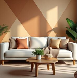
Monochromatic Scheme: Variations of a single hue, offering a subtle and cohesive look.
-
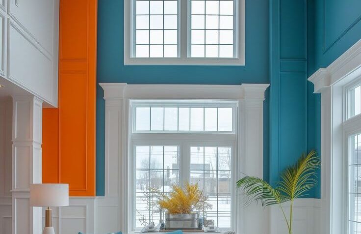
Complementary Scheme: Opposite colors on the color wheel that create high contrast and vibrant energy.
-
Analogous Scheme: Colors adjacent to each other on the color wheel, providing a harmonious and unified effect.
Choosing a color scheme depends heavily on the function and emotion of the space. For instance, bedrooms benefit from calming tones, while workspaces may need more invigorating colors to boost focus and creativity.
Choosing the Right Colors for Your Space
Let’s explore how specific colors influence mood and functionality in interior spaces:
-
White: Symbolizes purity, peace, and cleanliness. Ideal for making rooms appear larger and brighter.
-
Red: Evokes energy, warmth, and passion. Best used as an accent to avoid overstimulation.
-
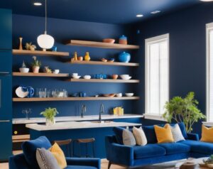
Blue: Brings serenity and calm. Light blues open up spaces, while darker tones add intimacy.
-
Green: Reflects nature, harmony, and balance. Perfect for kitchens, libraries, or dining spaces. Pairing green with plants enhances this natural effect. A 2021 study in the Journal of Environmental Psychology even showed a 15% boost in focus among individuals working in green-toned environments.
-
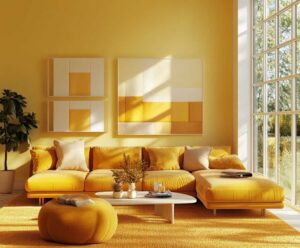
Yellow: Cheerful and optimistic. Ideal for accents and accessories, as too much can feel overwhelming.
-
Purple: Suggests luxury and sophistication. Light purples are soothing, while darker ones add drama.
-
Black: Offers depth and elegance. Best balanced with lighter shades to avoid a gloomy effect.
-
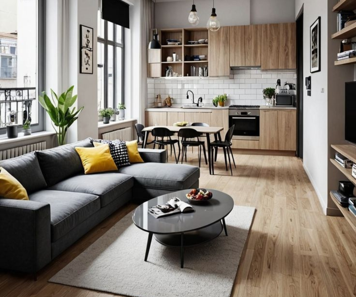
Grey: Conveys modernity and calmness. A versatile neutral that complements a wide range of color accents.
Conclusion
Color isn’t just a visual choice—it’s a powerful psychological tool. By choosing the right hues and schemes, homeowners can create emotionally enriching spaces that reflect their unique personalities and needs.
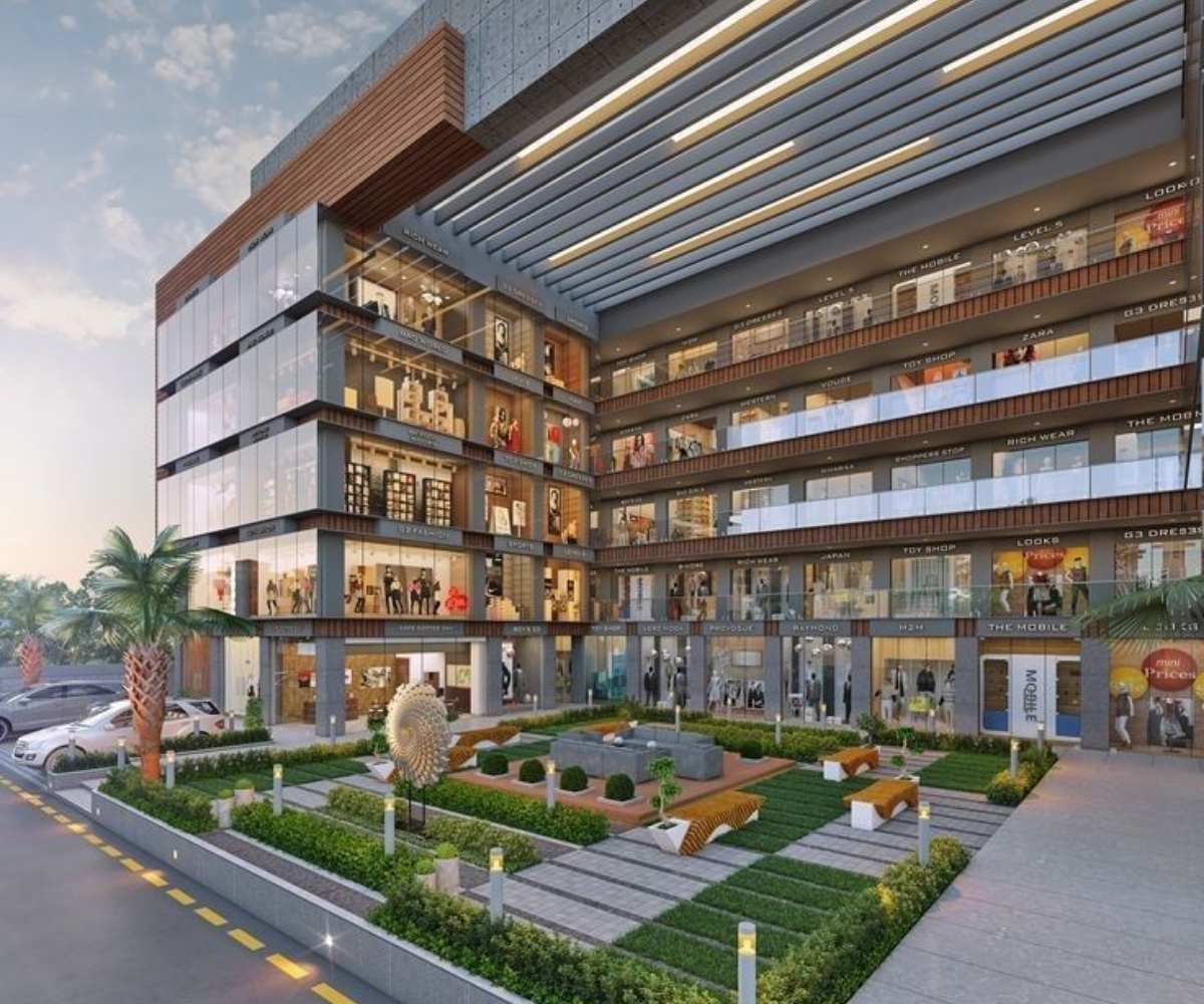
At Alakar Thirupathi Builders, we use this understanding of color psychology to craft interiors that not only look stunning but feel just right.